Wednesday, November 23, 2011

Original

Photoshopped
If you take a look at the first image, it's relatively similar to the second image, except that the second image has a slightly visible rainbow. I made the rainbow with help from this site
It shows you a step by step procedure, with pictures, on how to add a rainbow to your image. It can also show you how to add a double rainbow, which is something I haven't yet done, but would love to learn, and this website will show me how!

Peep Egg Viewer


This is an optical toy called the Peep Eye Viewer. They are old souvenir-like toys. Basically you look through the hole at the top, and it magnifies whatever is on the opposite hand, to such a point, where if you put your hand on the hole, it would appear as pure darkness.

Tuesday, November 1, 2011

Chess Peice


This is the chess piece I drew. Our assignment was to make a chess piece which looks realistic, with a background which shows pattern, movement, and rhythm. I think my chess piece is realistic, because I shaded it exactly how I saw it in real life, and can be recognized as a chess piece.  The proportions are exact, as well, because though the chess piece looks bigger than the books in comparison, I don't think it's too hard to tell that the chess piece was drawn closer to the human eye, therfore making it seem bigger than it really is. 

I think my background shows pattern, in the books. The books show repetion but differ in size and thickness, which also cause rhythm. I think my background shows movement because your eye is drawn from one book on the page, to the others.

This chess piece was drawn from a eye level, and to do so, I had stacked many books atop each other creating a ledge/shelf that reached high enough for me to look straight ahead. I placed my chess piece right above that.

 As you can see from the shading on the chess piece and in the books on the background, it was darker on one side, and that was where the light from the lamp, wasn't hitting, and is mostly on the right side. On the left side, there's very little shading, and the parts that do have shading, are very light, and nearly impossible to see. They emphasize the other parts of the chess piece, and stand out against the white in the background, and the white in the chess piece. I made the dark shadows black, not only so they would stand out, but because it looks interesting compared with the light of the background, or so I thought.

In conclusion, I'm really happy with the outcome of my chess piece, but theres always room for improvement. I would love to do something like this again, now that I have some practice with it.
I hope you all enjoyed my art. :)

Friday, October 21, 2011


I think this photograph shows selective focus, because it focuses on the football players fighting on the ground and everything else is a little blurred out and out of focus. Your eye automatically goes to the fighting football players, making them the main point, or center attraction of this photograph. The rest of the background is blurred, slightly but noticeably creating an interesting and different feel and illusion displayed by this photograph.


I think this picture shows depth of field and linear perspective. It shows depth of field because there is a good amount of distance from the objects closest to you, and the object farthest away from you, It shows linear perspective because of the tile lines on the floor, and once again, the amount of distance in the picture. The lines and the objects converge in the distance, adding on to the effect of depth of field in this photograph.


I think this picture also shows depth of field and the diagonal line. Depth of field because of the space between the '#10' football player, and the cheering crowd at the other end of the field/picture. This shows the diagonal line, because if you follow the heads of the football players, you'll see that they move your eye in a diagonal line across the field. The white line drawn on the football field helps too, because it gives you the essence of an actual visible diagonal line.

Wednesday, October 19, 2011

Photo Composition

Rules of photo Composition are very important. :)))
This first website differentiates the different photo composition rules, and gives us individual pictures and media examples to help us better understand what makes a good photograph, and what to avoid when taking a picture.


This next website helps us understand Photo Composition by displaying grid lines and diagonal lines so we can enhance on our knowledge of rules such as The Rule Of Thirds and The Golden Section Rule, both really important rules to know and take note of.

Check out some of these sites!

Monday, October 17, 2011

Logo Assignment

This is my logo. The first one is in colour, and the second one is the same image in a black and white effect.

This logo was made to represent me and what my name means. Research proved my name meant graceful and elegant, as well as delightful and energetic. Those were the qualities I used to create this logo. 

I then researched more about the characteristics of the name to get into more detail. I found out that dance was a common denominator for the qualities from before, specifically ballet.

In the colour version of my logo, i used a pale blue-green, subtly in the shape of a random swirl in the back. I also added a drop shadow of the same blue-green colour. I chose the font 'Zapfino' because of it's elegance and simplicity. It represented the logo perfectly and it gave the entire piece a more finished look. The type of line I used in this piece was a thin white line, outlining only a few of my dancers physical attributes. I chose to put a swirl in the background to represent a ribbon, a prop used by most ballerinas worldwide. I chose to put the swirl behind the actual image because it wouldn't interfere with the entire image and I liked the way the dancer seemed to be physically infront of her ribbon giving an unrealistic look to it. 

This logo was made using the pen tool on Adobe Illustrator and this was a new concept for me, as a designer. It was difficult to get the correct line type on my image because of the awkward position of the dancer. The hands and hair were difficult to do, because the fingers on the hand were placed oddly, and the hair was really big and full, making it difficult to get each curl correctly, but i got the hang of it, and i will definately be using this tool more as I grow as a designer. I also learned how to use layers correctly for their right purpose and the layers are a great tool to help keep organized, and I'm glad I learnt to use this tool as well.

I'm really happy with the way my logo turned out, and I think it represents me perfectly. The colour, shape, and line all look great to me, and seems almost too professional to be called my artwork. 


Friday, September 30, 2011

Friday, September 23, 2011

Improvisation 31 - Wassily Kandinsky 1913


Improvisation 31 (Sea Battle) is an abstract painting by the russian painter Wassily Kandinsky. This painting would be a very poor painting if judged Imitationally due to the crazy shapes and colours in this image. You can see organic shapes in the painting, which represent, or are supposed to represent boats and ships. Though the ships and boats seem to be sailing on a red carpet, it isn't hard to tell that they were drawn on a body of water, which is most likely a Sea, given the title of this painting. The ships seem catastrophic, and judging by the title you can see that the boat/ship like figures and meant to be fighting, or that perhaps there were rough waters. Though this painting is an abstract, you can tell by the shapes, rather than the colours, of why and how this might be a Sea Battle.

This painting is a piece of art which represents the elements of design in a unique way. It represents colour, individually. Colour is an important part of this painting because without it, the essence and message of this portrait will be displayed differently without colour, or which different colours. The artist used warm colours. This painting doesn't use very many lines, but the ones that are used are organic rather than mechanical and are used well because the whimsical lines display an overall different message, and are strong and confident, rather than poor and weak. There are also organic shapes in this painting which also help convey the messages of the artist. The shapes are drawn well, because you can tell what the shapes are supposed to be, and they aren't that different than those of real life. Space is an important part of this picture. This element has some negative spaces, but most are positive and used well as well.

Judged emotionally, this painting isn't one of the best paintings, but isn't one of the worst either. This piece conveys confusion because of the weird and odd, out of this world shapes and colours which are randomly staggered across the canvas. This painting also displays the emotion happiness, as it brightens your mood cause of the warm, and welcomimg shapes and colours. It leaves you with a smile as you look at the painting, because it's so 'out there' you automatically makes you feel a lot happier and filled with joy. This painting is capable of changing your mood, in a positive way and has the power to keep you captivated for a long time.


Monday, September 19, 2011

Rhythm Assignment


This is the first version I made, and it consists of thick and thin lines, which are spread out, unevenly across the page. The lines are the same direction and quality. I think this shows rhythm because your eye is drawn to the very thick line in the middle, creating emphasis, and it slowly moves around the page, at the other types of lines.

My second version, is made up of many lines, diagnol, horizontal, and vertical. Some of the lines near the top left and bottom right are bolded, and I feel this is why the attention of someones eye is shifted there, and then moved to the rest of the image.

Andy Warhol

Andy was a famous artist, that was known for his famous hair, but there's a lot more to him than campbell soup and celebrities. He was born in the Ghetto part of Pittsburgh, the time of The Great Depression. Who would have thought a small boy, eating Campbell soup and drinking Cola, would become a famous artist, looked up to by Soup and Soda labels around the world?

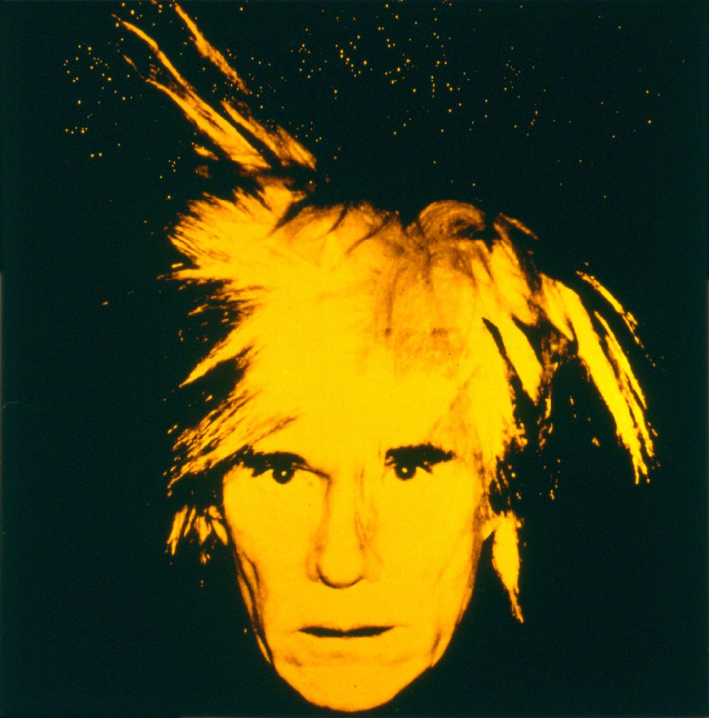
It's known that most artists are crazy, and that might or might not be true. Andy might be considered crazy in some people's eyes, because of his outstretched fashion flops, including the crazy wigs, and bright colors, but Andy had a terminal disease, called Chorea which caused him to stay in bed a lot, getting his inspiration from magazines and making collages for his mom, and giving a reason to his out there wardrobe.

By the time Andy was 21, he had a dream. He wanted to be a famous artist, and he moved to New York with only $200 in his pocket. In the modern day, $200 dollars might last you a week or two, but Andy needed it to last him his entire life!
That is, until he started making money of his own.
It started with selling his art pieces for $12.50 at cafes, but gradually became more famous, as time went on, and are now worth thousands more.

One important factor in Andy's life had to have been 'The Factory.' The Factory was a small workplace or art studio where Andy used to paint and do his work, but it became one of the hottest places to be seen. If anyone was anyone, they'd want to be seen with Warhol. Stars such as Marilyn Monroe became one of Andy's closest friends, and would hang out other celebrities at The Factory, while Andy watched.

Andy is now one of the most respected artists in the world, owning museums and bridges around the world. His face is on T-shirts, and cups, and mugs, and is known by mostly anyone.


Andy is an amazing artist, whose work will continue to change the lives of many others. :)